- 29.07.2021 /
- Variety
This Christmas is looking set be rather special. After the last 18 months when we have been apart so much, it looks like we’re on track to welcome friends and family into our homes once again to celebrate a traditional festive season that we all missed so much last year.
With a renewed sense of optimism prevailing as we get set to ring in the New Year with loved ones, creating a winter wonderland in our homes is more important than ever. No event in the calendar creates such a sense of ‘holiday at home’ than Christmas – and there’s only one plant that’s guaranteed to make everyone feel Christmassy and that’s the poinsettia.
Events of the past year, which have seen so many of us working from home and spending more time under our roofs than ever before, have changed the dynamic of our properties. With apartments and houses now adapted to incorporate home offices, and families seeking to transform living spaces into an oasis of calm that’s sheltered from the turbulence of the outside world, interior décor has upped its game with a trend for the use of bold, stand-out colours that aim to make a statement. Contemporary backdrops present the opportunity to let our creative juices run riot – and stage high-impact poinsettia displays that will stop visitors in their tracks.
Here, we focus on the interior décor hues that experts predict will be gracing the nation’s homes as we prepare to say goodbye to 2021, and predict how en-vogue colours will influence the nation’s choice of poinsettias as the year draws to a close.
Embracing revitalising reds
Turn back the clock to the Millennium and choosing a poinsettia was a simple matter. At the turn of the century the nation was obsessed with Scandinavian minimalism, and the walls of almost every new build property were sporting that rather unremarkable tone called magnolia. A traditional red-topped poinsettia would proudly stand out against such a neutral backdrop, making it a cinch to choose a plant to create a statement feature.
Two decades later, homeowners are opting for darker, bolder tones, and one fashion that’s come to the fore is the rise of reds. The colour supremoes at Pantone highlight two shades of red that are tipped to be the height of popularity this winter: ‘Winery’ (think the classic deep red of a glass of vino) and ‘Red Alert’ – a shocking red that fashion experts describe as having a “suggestive presence”. Paint giant Dulux also highlights reds, from ‘Berry Pop’ to ‘Lost Coral’, as popular shades this season, highlighting their ability to “infuse optimism into everyday living”.

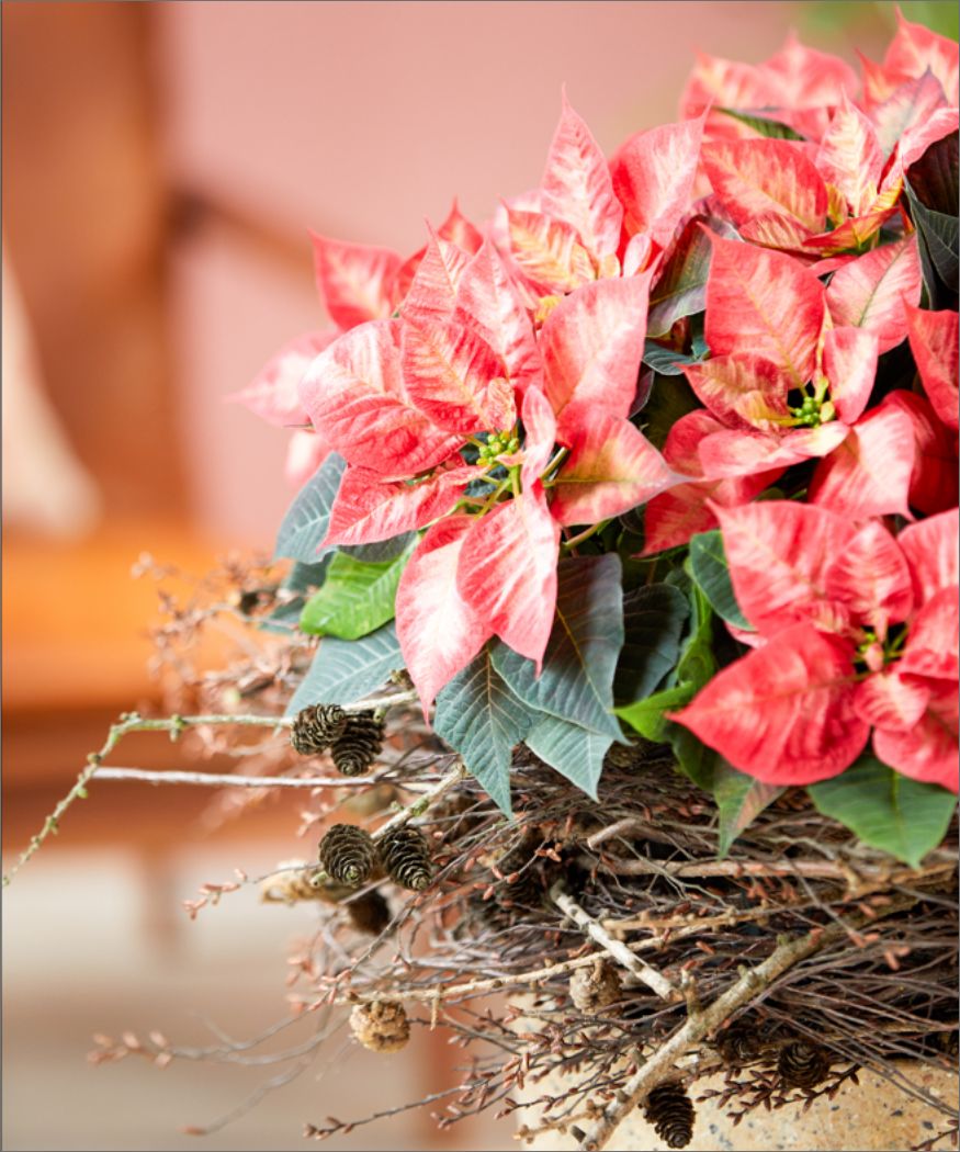
Where reds adorn walls, the opportunity arises to create a dynamic contrast that enables poinsettia hues to work their magic. Plants with ice-white bracts or soft cream shades rekindle memories of the cold, snowy winters we cherished as children, standing out due to the vivid light shades of their wonderful coloured bracts. Of course, a traditional red-topped poinsettia will be at home too, for those who prefer a plant that blends subtly with their choice of interior décor.
Banishing festive blues
The stay-at-home culture and grounding of international air travel has given us time to think about the effects of our hectic, pre-pandemic lifestyles on the environment, so it’s no surprise to see glossy coffee table magazines highlighting shades of blue that pay homage to the natural world as topping the fashion stakes this season. Shades that remind us of the depths of the oceans and purity of clear skies are all the rage. The trend isn’t limited to wall coverings either; if you’re in the market for a new fitted kitchen, units sporting contemporary and traditional blues are tempting buyers, whether they’re seeking traditional shaker-style cabinets or the latest handle-less units.
Homes adorned by blue open the door to a world of dramatic poinsettia staging opportunities. The tone of winter skies creates a perfect backdrop for poinsettias with creamy bracts or traditional festive red tops, while those who aren’t afraid to make a statement can stage a dynamic contrast by choosing one of the vivid pink varieties that grace garden centre shelves – we dare you to be brave!

Greys, olive and earth tones reign supreme
Freezing temperatures combined with threatening grey skies are an indicator that a winter white-out is looming. It’ll come as no surprise that grey also remains the dominant colour trend in interior design; after all, ‘Ultimate Gray’ is one of Pantone’s ‘Colours of the Year’ 2021. Similar buff and brown-based neutrals, and soft olive shades, top the stakes in Dulux’s colour charts this year.
Greys and darker, earthy hues create a sophisticated backdrop that allow festive poinsettias to unleash their full potential. For those who are keen to create a talking point, the latest generation of variegated and marbled poinsettias perfectly offset sophisticated grey and earthy backgrounds, while yellow-topped varieties present the opportunity to stage a contrast for daring displays that’ll go down a storm if uploaded to Instagram.

On a final note, we can’t fail to mention that Pantone’s other ‘Colour of the Year’ 2021 goes by the name of ‘Illuminating’. While its title doesn’t give much away, the shade is hailed as a “bright, cheerful yellow, imbued with solar power’. We can’t think of a better backdrop for a traditional red-topped poinsettia with deep green leaves – even if the dazzling contrast leaves you reaching for your sunglasses!
no active widgets